Most ad budgets are not wasted on bad ads. They are wasted on the page the ad sends people to. A good click lands, the visitor waits three seconds for a slider to load, sees a headline that does not match the ad, scrolls past a form with nine fields, and leaves.
This checklist covers the 15 points we check on every landing page before a client spends money on Google or Meta ads. Each one is quick to test, and most are cheap to fix.
Before you start: one page, one goal
A landing page is not a homepage. It exists for one audience, one offer and one action: book a call, request a quote, claim a free trial, send a WhatsApp message. If your page is trying to do three things, fix that first. Everything below assumes a single goal.
If you are still deciding whether you need a separate landing page at all, our guide on landing page vs website explains when each one makes sense.
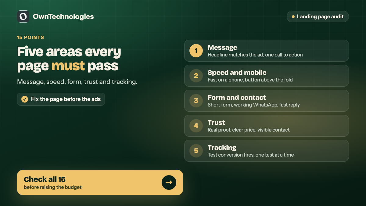
The 15-point landing page conversion checklist
| # | Check | Section |
|---|---|---|
| 1 | Headline matches the ad | Message |
| 2 | Offer is clear in five seconds | Message |
| 3 | One primary call to action | Message |
| 4 | Benefits before features | Message |
| 5 | Loads fast on a phone | Speed and mobile |
| 6 | Built for thumbs, not mice | Speed and mobile |
| 7 | Call to action visible without scrolling | Speed and mobile |
| 8 | Short form, or a chat option | Form and contact |
| 9 | Click-to-call and WhatsApp work | Form and contact |
| 10 | Thank-you page and instant reply | Form and contact |
| 11 | Real proof near the call to action | Trust |
| 12 | Clear price or price range | Trust |
| 13 | Contact details and policies visible | Trust |
| 14 | Conversion tracking tested end to end | Tracking |
| 15 | One test running at a time | Tracking |
Message: does the page say the right thing?
1. The headline matches the ad
If the ad says “Free dental check-up in Dubai Marina”, the headline should say the same thing, not “Welcome to Smile Clinic”. People click an ad because of a promise. When the page repeats that promise, they stay. Google also looks at how relevant your page is to the ad when it rates landing page experience, which affects what you pay per click.
2. The offer is clear in five seconds
Show the page to someone who has never seen it for five seconds, then ask what you offer and what they should do next. If they cannot answer both, the top of the page needs rewriting.
3. One primary call to action
Every button on the page should lead to the same action. A “Book now” button, a “Download brochure” link and a newsletter signup compete with each other. Pick one and repeat it two or three times down the page.
4. Benefits before features
“Same-day appointments” beats “12 treatment rooms”. “Your website live in 3 weeks” beats “built on Next.js”. Lead with what the visitor gets, then support it with the features.
Speed and mobile: can people actually use it?
Most paid traffic from Meta, and a large share from Google, arrives on phones. Test on a real phone over mobile data, not on your office Wi-Fi.
5. It loads fast on a phone
Run the page through PageSpeed Insights and look at the mobile result. Google’s Core Web Vitals explain what “fast” means in practice. The usual culprits are huge images, sliders, chat widgets that load on every page, and too many tracking scripts. Our website speed quick fixes covers the cheapest wins.
6. Built for thumbs, not mice
Buttons large enough to tap, text readable without zooming, no pop-up covering the screen on arrival, and forms that open the right keyboard (number pad for phone numbers).
7. The call to action is visible without scrolling
On a phone, the main button or form should appear on the first screen. Many pages bury it under a hero image and a paragraph of brand story.
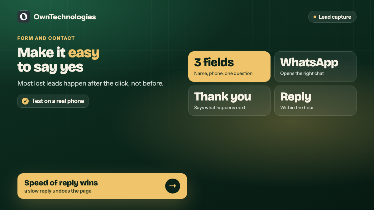
Form and contact: is it easy to say yes?
8. A short form, or a chat option
Ask only for what you need to reply: usually name, phone and one qualifying question. Every extra field costs enquiries. If your customers prefer to chat, offer that instead of the form, not as well as five other options.
9. Click-to-call and WhatsApp work
Tap every phone number and WhatsApp button on a real phone. Broken click-to-call links, wrong country codes and WhatsApp buttons that open a blank chat are common, and they quietly lose leads. In markets like India and the UAE, a working WhatsApp button often outperforms the form. We cover the setup in WhatsApp integration for websites.
10. A thank-you page and an instant reply
After someone submits, send them to a thank-you page that says what happens next and when. Then reply fast: an automatic confirmation by email, SMS or WhatsApp, followed by a real person within the hour if you can. A slow reply undoes everything the page achieved.
Trust: do they believe you?
11. Real proof near the call to action
Reviews with names, client logos, photos of your actual team or premises, before-and-after examples, and certifications that matter in your industry. Put the strongest one right next to the button, where the visitor is deciding.
12. A clear price or price range
“From AED 3,500” or “Plans from $99 a month” filters out people who cannot afford you and reassures those who can. Hiding all pricing usually means more enquiries that go nowhere.
13. Contact details and policies are visible
A real address, a phone number, and links to your privacy policy and terms. These matter to visitors and to ad platforms, which review landing pages before and during campaigns.
Tracking: will you know what worked?
14. Conversion tracking tested end to end
Submit a test enquiry and confirm it appears as a conversion in Google Ads, Meta Events Manager or both, and in your CRM or inbox. Pages that “have tracking installed” but never fire the conversion event are very common, and they make every optimisation decision a guess.
15. One test running at a time
Change one thing, such as the headline, the offer or the form length, and give it enough traffic to judge. Changing five things at once tells you nothing about which change mattered.
Common mistakes we see
- **Sending ad traffic to the homepage.** It was built for everyone, so it converts no one in particular.
- **Copying a competitor’s page.** Their offer, audience and price are different.
- **Auto-playing video with sound.** Most visitors leave.
- **Stock photos of smiling strangers.** Real photos of your team and work convert better and cost less.
- **No follow-up plan.** A form that emails a shared inbox nobody watches on weekends.
What it costs to fix or build a landing page
These are planning ranges for an experienced offshore or hybrid team.
| Option | What you get | Cost | Timeline |
|---|---|---|---|
| Landing page audit | Written list of fixes against this checklist | Free to $300 | 2 to 3 days |
| Fix an existing page | Speed, mobile, form, tracking and copy fixes | $300 to $1,200 (around 25,000 to 1 lakh INR) | 3 to 7 days |
| New landing page | Design, copy structure, build, tracking, thank-you page | $600 to $2,500 (around 50,000 to 2.1 lakh INR) | 1 to 3 weeks |
| Landing page plus ad management | Page, Google or Meta campaigns, monthly testing | From $500 a month plus ad spend | Ongoing |
If you run ads for a clinic, our guide to Meta ads for dental clinics shows how the page and the campaign work together.
Frequently Asked Questions
A headline that matches the ad, a clear offer, one call to action, fast mobile loading, a short form or chat option, real proof near the button, and tested conversion tracking.
As few as you need to reply, usually name, phone and one qualifying question. Every extra field reduces the number of people who complete the form.
As fast as possible on a phone over mobile data. Check the mobile result in PageSpeed Insights and fix large images, sliders and unnecessary scripts first.
Usually not. A dedicated landing page that matches the ad and has one goal almost always converts better than a homepage built for every visitor.
Submit a test enquiry and confirm it shows as a conversion in Google Ads or Meta Events Manager and arrives in your CRM or inbox.
Yes. We check your page against this 15-point list and send a plain-English list of fixes, ordered by impact.
Final Thoughts
A landing page converts when it keeps the ad’s promise, loads fast on a phone, makes the next step obvious and easy, and proves you are real. Run through these 15 points before you raise your ad budget. Fixing the page is almost always cheaper than buying more clicks.
Want a second opinion on your page? Our PPC and paid ads team runs Google and Meta campaigns, our website development team builds landing pages that load fast and convert, and our CRM team makes sure every lead gets a fast reply. Ask for a free landing page audit and we will send you the fixes that matter most.