Most travel booking websites do not lose people because the trip is wrong. They lose them somewhere between “this looks good” and “book now”, usually on a phone, usually because a detail the traveller needed was hiding behind three taps.
LifeTrip is a travel booking experience we designed and built. The brief was short: make trip discovery simple, keep the booking details people check before they commit in plain sight, and make the whole thing work properly on a phone. This post walks through the features that brief turned into, and what any travel or tour business can take from it before commissioning a booking site of its own.
The real problem: the gap between browsing and booking
Travel is a high-consideration purchase. Someone booking a trip is spending real money on something they cannot inspect before they pay for it, so they check everything twice. Dates. What is included. What happens if plans change. Who they are actually paying.
A typical travel site answers those questions, but in the wrong places. The inclusions sit in a tab. The cancellation terms sit in a footer link. The final price appears on step four of a five-step checkout. Every one of those is a moment where a careful traveller stops, opens a new tab, and compares you with someone else.
That is the gap LifeTrip was built to close. The goal was not more features. It was fewer reasons to leave between the first click and the reservation.
Trip discovery that stays simple without hiding the details
The first challenge on the project was a contradiction. Discovery has to feel light, or people never start. But the details people check before committing cannot be hidden, or they never finish.
The answer was to separate what a traveller needs to choose from what they need to commit, and show each at the right moment:
- **On the listing:** destination, duration, a starting price and the one or two things that make this trip different. Enough to decide whether to look closer, nothing more.
- **On the trip page:** the full plan, inclusions and exclusions, dates and the key booking terms, all visible without opening tabs or accordions.
- **In the booking flow:** only what is needed to reserve, with the trip summary kept on screen so nobody has to scroll back to remember what they picked.
This sounds obvious written down. In practice most travel sites put everything on the listing card, which makes browsing slow, and then hide the terms on the trip page, which makes committing scary. Getting the split right is most of the work.
A booking flow built on steps, feedback and next actions
The second decision on LifeTrip was to design the reservation as a clear sequence rather than a maze. The interface prioritises steps, feedback and next actions over decorative travel imagery. That last part is deliberate. A beautiful hero photo does nothing for someone trying to work out whether their dates are available.
Show the steps before the first one
Travellers relax when they can see how long something will take. A visible step indicator (“Trip, Travellers, Review, Pay”) tells people the journey is short and finite before they start it.
Confirm every action
Every input gets a response. A date picked, a traveller added, a code applied: each one updates the summary immediately. Silence after a tap is where people start to wonder whether the site is working, and on a slow mobile connection that doubt arrives fast.
Always make the next action obvious
At every point in the flow there is one primary button and it says exactly what happens next. Not “Continue”, but “Review your trip” or “Confirm and pay”. Secondary actions exist, but they never compete visually with the main one.
Trust cues for an online travel decision
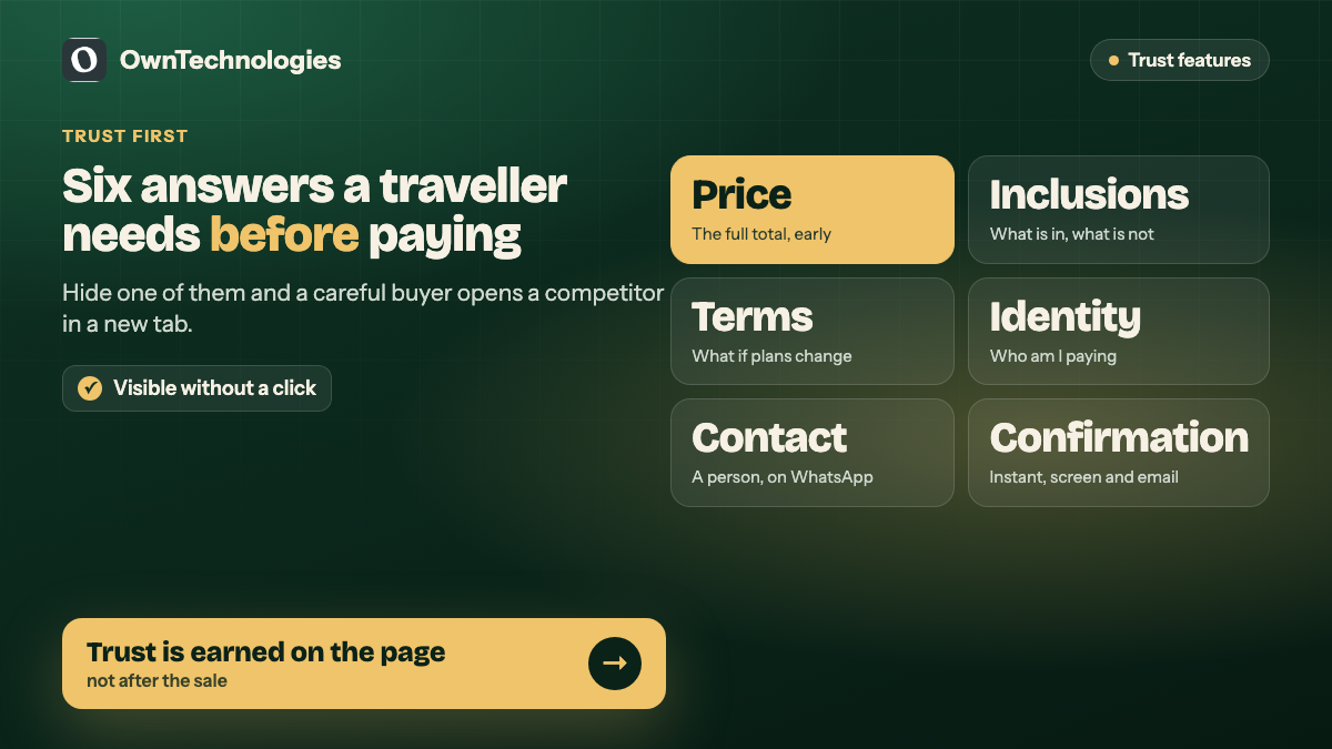
Online travel decisions demand transparent information. Travellers are handing money to a business they may have found five minutes ago, for a service that happens weeks later. The site has to earn that trust on the page, not after the sale.
These are the trust features we treat as non-negotiable on any travel booking website:
| Trust feature | What it answers | Where it belongs |
|---|---|---|
| Full price, early | “What will I actually pay?” | Trip page, before the booking flow starts |
| Inclusions and exclusions | “What am I getting?” | Trip page, visible without a click |
| Cancellation and change terms | “What if my plans change?” | Trip page and the review step |
| Clear business identity | “Who am I paying?” | Footer, contact page and confirmation |
| Real contact route | “Can I reach a person?” | Every page, ideally WhatsApp or phone |
| Booking confirmation | “Did it work?” | Screen and email, immediately |
Price surprises are the big one. Baymard Institute’s long-running research on checkout abandonment consistently lists extra costs revealed late in checkout among the top reasons people abandon. Travel, with its taxes, fees and supplements, is especially exposed to it.
A real contact route matters more in travel than almost anywhere else. A lot of travellers want to ask one question before they pay. If the only way to ask is an email form with a two-day reply, they ask a competitor instead. We covered the options in detail in WhatsApp integration for websites.
Mobile first, not mobile also
The third challenge on LifeTrip was that mobile had to work as the primary surface. People research trips on their phones in spare minutes: on a commute, in a queue, in bed. A travel site that only really works on a laptop is a site that loses the research phase entirely.
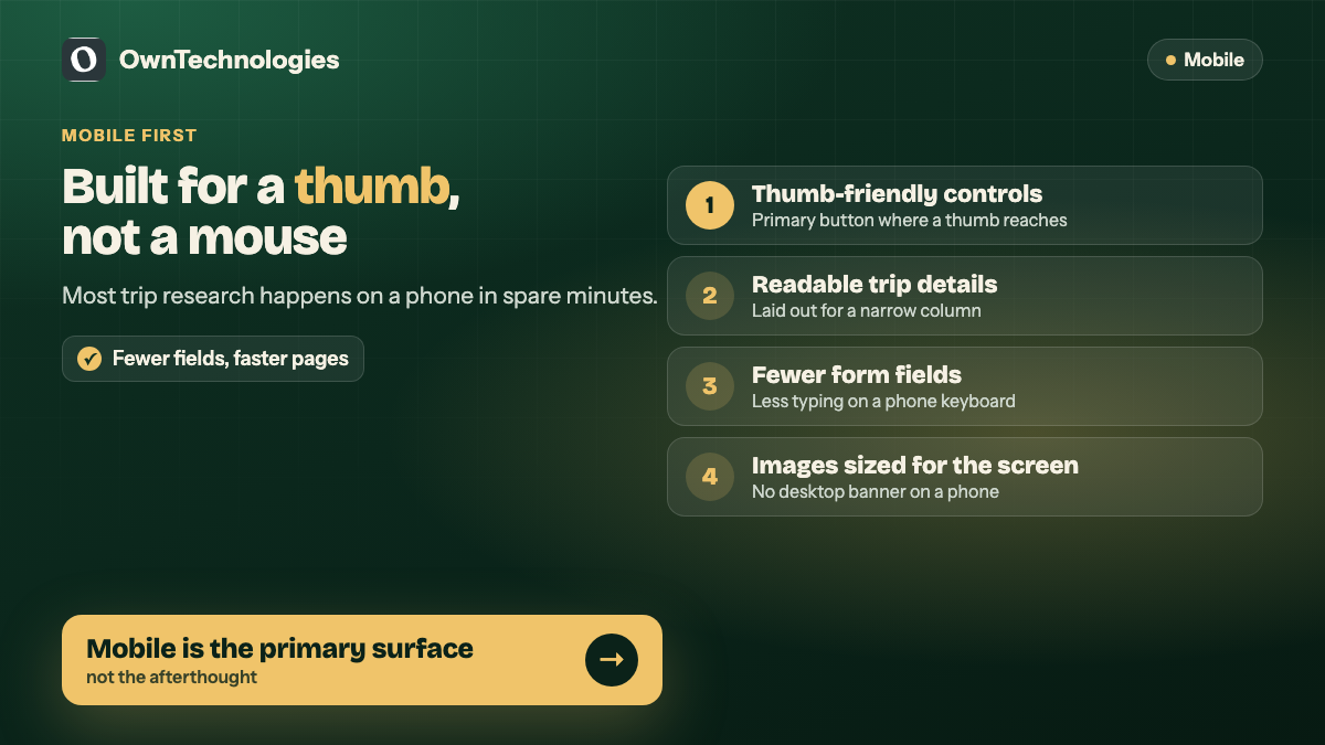
Mobile-first on LifeTrip meant concrete decisions, not just a responsive grid:
- **Thumb-friendly controls.** Primary buttons sit where a thumb reaches, and tap targets are large enough to hit first time.
- **Readable trip details on small screens.** Itineraries and inclusions are laid out for a narrow column, not shrunk from a desktop table.
- **Fewer fields.** Every field removed from the booking form is one less thing to type on a phone keyboard.
- **Fast loading.** Travel pages are image-heavy. Images are sized for the screen that requests them, so a phone is not downloading a desktop banner.
Speed is worth taking seriously. Google’s Core Web Vitals measure loading, responsiveness and visual stability, and a gallery-heavy travel page can fail all three. Our website speed quick fixes post lists the changes that usually make the biggest difference.
Features a travel booking website actually needs
Not every travel business needs the same build. A boutique tour operator and an online travel agency have very different requirements. This is the feature list we work from, split by what is essential and what can wait.
Essential from day one
- Trip or package pages with itinerary, inclusions, exclusions and price
- Search or filtering by destination, date and duration
- A short booking flow with a live summary
- Clear cancellation and change terms
- Online payment or deposit, with an instant confirmation
- An admin panel to add trips, update prices and see bookings
- A direct contact route on every page
Worth adding in phase two
- Live availability and seat or room limits
- Traveller accounts with booking history
- Automated reminders before departure
- Reviews and traveller photos
- Multi-currency pricing for international visitors
- Supplier or partner portals
The admin panel is the feature most often underestimated. If your team cannot change a price, close a date or add a new trip without calling a developer, the site will be out of date within a month. That is also where a booking website starts to overlap with a CRM, which we discuss in booking and appointment software for service businesses.
What a travel booking website costs in 2026
Costs depend mostly on whether bookings are confirmed by a person or by the system. These ranges assume an experienced team working offshore or in a hybrid model.
| Type of site | What it includes | Typical cost | Timeline |
|---|---|---|---|
| Enquiry-based travel site | Trip pages, filters, enquiry and WhatsApp, simple admin | $5,000 to $10,000 (around 4 to 8.5 lakh INR) | 4 to 6 weeks |
| Booking site with payments | Above plus booking flow, deposits, confirmations, booking dashboard | $12,000 to $25,000 (around 10 to 21 lakh INR) | 8 to 12 weeks |
| Live availability and accounts | Above plus inventory limits, traveller accounts, reminders | $25,000 to $45,000 (around 21 to 38 lakh INR) | 12 to 16 weeks |
| Multi-supplier platform | Supplier portals, payouts, third-party inventory APIs, apps | $45,000 and up (around 38 lakh INR and up) | 16 weeks and up |
Most independent operators should start in the first or second row. The enquiry model is not a compromise for a business that sells tailored trips: those bookings are usually confirmed by a conversation anyway. For a deeper breakdown of what drives website pricing, see our custom website development cost guide.
Mistakes we see on travel booking sites
These come up again and again when we review travel and tour websites:
- **Decoration over decisions.** A full-screen video hero and a booking button below the fold.
- **The price appears last.** Taxes and fees added on the final step.
- **Terms in a PDF.** Cancellation policy as a download nobody opens until something goes wrong.
- **Desktop tables on mobile.** Itineraries that need sideways scrolling on a phone.
- **No way to ask.** A contact form as the only route, with no phone or chat.
- **An admin nobody can use.** Prices that stay wrong because updating them needs a developer.
What LifeTrip shows about booking design
The outcome on LifeTrip is a practical booking interface that reduces friction from browse to reserve. Travellers can discover options, review what matters and move forward with more confidence, especially on mobile.
None of that comes from a single clever feature. It comes from a series of small decisions that all point the same way: show the right detail at the right moment, confirm every action, and make the next step obvious. You can see the project on our LifeTrip portfolio page.
Frequently Asked Questions
At minimum: trip pages with itinerary, inclusions and price, search or filters, a short booking flow with a live summary, clear cancellation terms, online payment or deposit with instant confirmation, an admin panel and a direct contact route. Live availability, traveller accounts and reviews can follow in a second phase.
In 2026 an enquiry-based travel site costs about $5,000 to $10,000 (around 4 to 8.5 lakh INR). A booking site with payments costs $12,000 to $25,000, and live availability with traveller accounts runs $25,000 to $45,000.
An enquiry-based site takes 4 to 6 weeks. A site with online booking and payments usually takes 8 to 12 weeks, and live inventory with accounts takes 12 to 16 weeks.
If your trips are tailored or confirmed by a conversation, start with enquiries plus WhatsApp. If you sell fixed departures with set prices, online booking with a deposit removes a step and usually pays for itself.
Most trip research happens on phones in spare moments. A site that only works properly on a laptop loses travellers during research, long before they are ready to book.
Yes. We designed and built the LifeTrip booking website, focused on clear trip discovery, visible booking details, a step-based reservation flow and mobile-first layouts.
Final Thoughts
A travel booking website succeeds on trust and clarity, not on decoration. Show the price early, keep the terms visible, confirm every action and design for the phone first. Get those right and most of the work of converting a browser into a booking is already done.
If you run a travel, tour or experiences business and your site is losing people between browsing and booking, we can help. Our website development team builds booking sites with admin panels your team can actually use, and we connect them to a custom CRM or a mobile app when you outgrow the basics. Book a free consultation and we will review your current booking flow with you.