Most InsurTech companies do not have a product problem. They have a “which of our fourteen products do you need” problem, and the website is where that question either gets answered or gets abandoned.
Artivatic is an AI-native insurance platform. It sells modular building blocks to insurers and health providers: underwriting, claims, onboarding, pricing, fraud and risk, each available on its own and all connected through an API gateway. We built the website that has to explain it. This is what that work actually involves, and what it teaches about presenting any modular B2B platform.
The problem: fourteen products, one homepage
Open the Artivatic catalogue and you find self-managed insurance for SMEs, API insurance infrastructure, location intelligence, pricing and personalisation, OCR and ICR document reading, a medical provider network, tariff management, risk inspection, payments and settlements, early claims, customer persistency, lead management and CRM. Behind them sit more than 400 APIs and over 20 native integrations.
Every one of those is a real product with a real buyer. Put them all on a homepage and you have a menu nobody reads. Pick three to feature and you make the other eleven invisible to the people who came looking for exactly those.
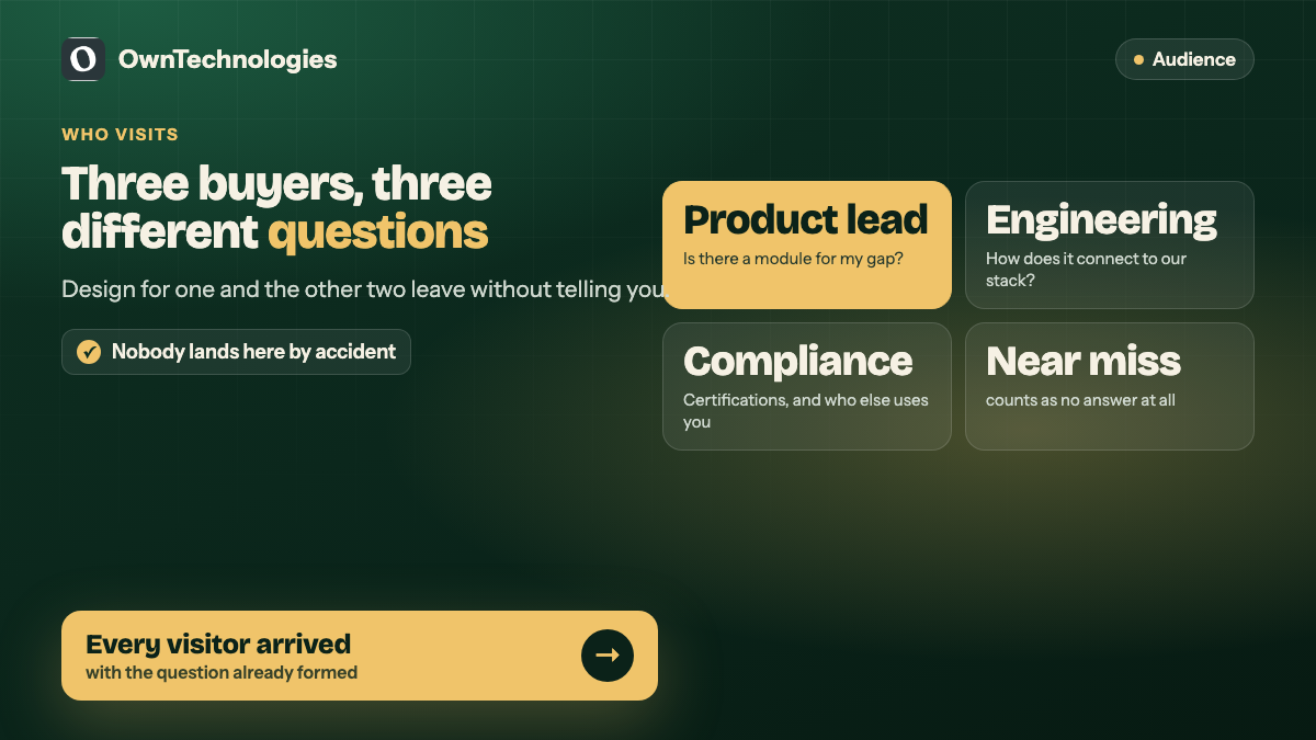
That is the actual design problem, and it is a very different problem from a consumer site. Nobody lands on an insurance infrastructure platform by accident. Every visitor arrived with a specific question already formed, which is both the easiest and the hardest kind of audience to serve: easy because you do not need to create demand, hard because a near-miss answer counts as no answer.
Who actually visits, and why it changes everything
A B2B platform in a regulated market gets three kinds of visitor, and they want completely different things:
| Visitor | What they arrived to find out | What loses them |
|---|---|---|
| Product or innovation lead at an insurer | Does a module exist for my specific gap | A generic “solutions” page |
| Engineering or integration lead | How does this connect to what we run | No API documentation visible before a sales call |
| Procurement or compliance | Are you certified, who are you, who else uses you | Trust signals buried below the fold |
The mistake is designing for the first visitor and assuming the other two will ask. They do not ask. They leave and you never learn they were there.
What we did about it
One page per module, not one page for all of them
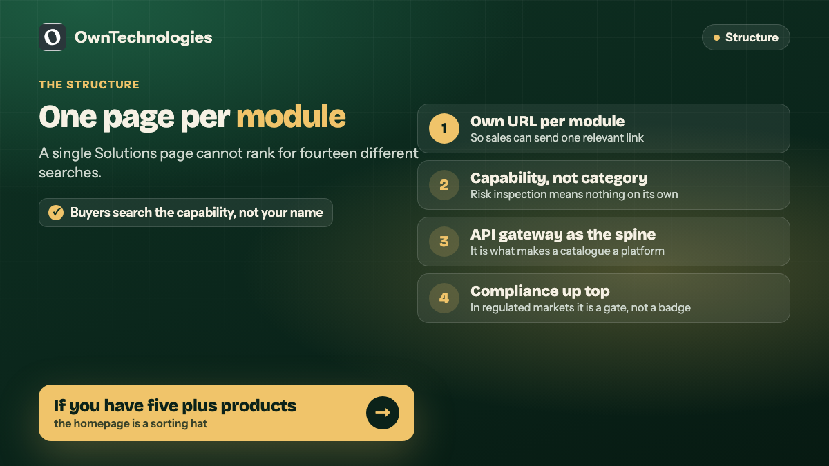
Each product gets its own URL with its own explanation. This is as much an SEO decision as a design one. A product lead searching for insurance claims automation or tariff management is typing the product name, not the company name. A single “Products” page cannot rank for fourteen different searches. Fourteen pages can.
It also means sales can send a link to the one thing a prospect asked about, instead of a homepage and an instruction to scroll. We made the same argument for a very different catalogue in lessons from building Hissini: when the model is unfamiliar, the site’s job is to teach it rather than to list everything it contains.
Lead with the capability, not the category
“Risk inspection” means nothing on its own. The same module described as using historical data, underwriting history, claims and geospatial data to build a risk-based product in under an hour is immediately legible to the person who needs it.
The rule we applied: every module gets one sentence a buyer could repeat to their own boss. If it cannot be said that way, the positioning is not finished, and no amount of design will cover for it. This is the same discipline we use on scoping generally, where the out-of-scope list is what forces the real decisions.
Make the API gateway the spine, not a footnote
When the product is modular, the integration story is the product. A buyer taking one module today needs to believe the second one will slot in later without another procurement cycle.
So the API layer is presented as the thing that holds the catalogue together, rather than a technical detail on a developer page. That single framing turns fourteen separate products into one platform, which is what justifies the relationship instead of the transaction.
Put compliance where the compliance person looks
In insurance and health, certifications are not badges. They are gating criteria. Being ABDM certified for health accounts, or holding the right data handling posture, decides whether a conversation happens at all.
Those signals belong near the top of the relevant pages, not collected on an “About” page that only the curious reach. The UK Government Service Manual’s guidance on writing for interfaces makes the same point in a different context: put the thing the user came for where they are looking, not where it is tidiest to file.
What this applies to beyond insurance
The pattern is not specific to InsurTech. Any business selling modular capability to other businesses hits the same wall.
- **If you have more than about five products, the homepage cannot be the menu.** It can only be the sorting hat. Its job is to get each visitor to the right page within two clicks.
- **Every module needs its own indexable page.** Your buyers search for the capability, not for you.
- **The integration story is what makes a catalogue a platform.** Without it you are a company that happens to sell several things.
- **Show the proof your buyer’s gatekeeper needs.** In regulated markets that is certifications. In others it is security posture, uptime, or named clients.
- **Write one repeatable sentence per module.** The test is whether a champion inside the buyer’s company can explain it to someone else without you in the room.
What we did not do
We built the website. We did not build the underwriting engine, the claims platform or the APIs. That distinction matters when you read case studies: presenting a complex platform well and engineering one are different jobs, and conflating them is how agencies oversell.
What we can say is that the structural choices above are the ones that decide whether a complicated B2B product is understood or merely admired. If you want the engineering side of our work instead, the custom CRM development guide covers what we actually build.
Frequently Asked Questions
For a multi-product platform site with individual module pages, a resource or documentation section and lead capture, expect $6,000 to $20,000 (5 to 16 lakh INR) depending on page count and how much content already exists. The number is driven by how many modules need their own page far more than by visual design.
Its own page, once you have more than three or four. Buyers search for the capability by name, and one page cannot rank for many different product searches. It also lets sales send a single relevant link.
Typically 6 to 12 weeks. The build is rarely the long part. Agreeing the one-sentence description for each module is what takes the time, because it forces positioning decisions the company may not have made yet.
If engineers influence the buying decision, yes. An integration lead who cannot see how your system connects will assume it is harder than it is, and that assumption is made silently.
Featuring the three products the founders are most excited about and leaving the rest in a dropdown. The products in the dropdown are usually the ones with the clearest buyers.
Yes. Most platform work of this kind is structure and content architecture rather than a rebrand, and keeping the existing visual identity usually makes the project faster and cheaper.
Final Thoughts
A modular platform lives or dies on whether a visitor can find the one block that solves their problem. The engineering can be excellent and the catalogue deep, and none of it matters if the person who needed tariff management could not tell that you offered it.
If you are selling several products to business buyers and your site is still one “Solutions” page, send us the list of modules and we will tell you how we would structure it, including which ones we think are being hidden. You can also see our website development and CRM development work, or browse the portfolio.